


Getting Started with Corebook°: Build Your First Brand Portal in a Few Clicks
Creating a brand portal used to mean messy PDFs, outdated Dropbox folders, and a dozen Slack threads just to find the right logo. Corebook° changes that.
If you’ve just signed up, this guide walks you through your very first steps—how to create a page, add modules, set your color palette, and upload custom fonts.
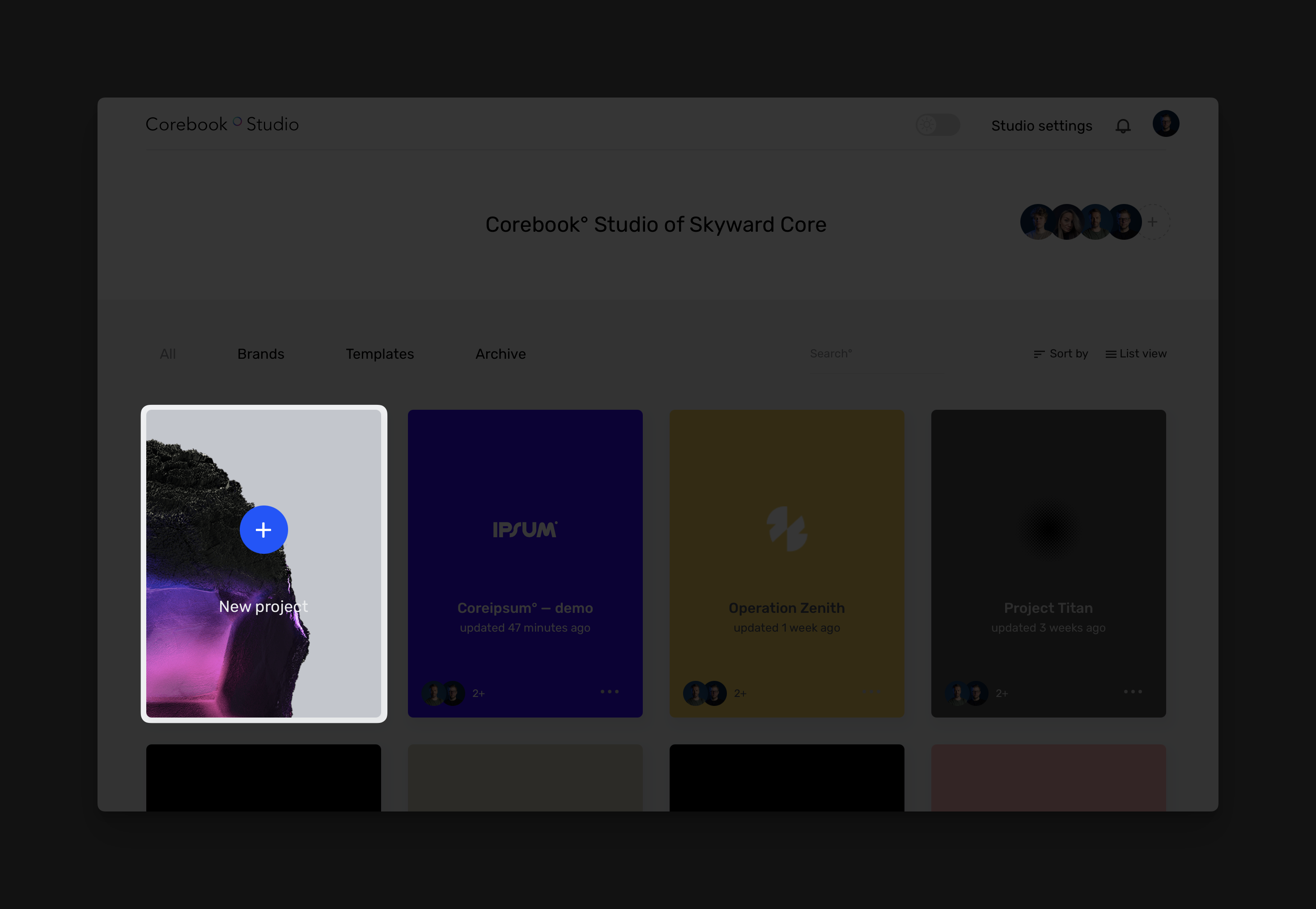
1. Create a New Project
After signing in:
-
Click “Create New Project”
Start from scratch or use a template (great for inspiration). -
Name Your Guide
Don’t worry—you can change this at any point. -
Select Initial Pages
This will add a few pre-built pages to get you started or spark ideas. -
Upload a Logo File
You can swap this later. For now, just drop in your current logo to anchor the space.
You’re all set. Your new brand project is live.
2. Add Your First Page
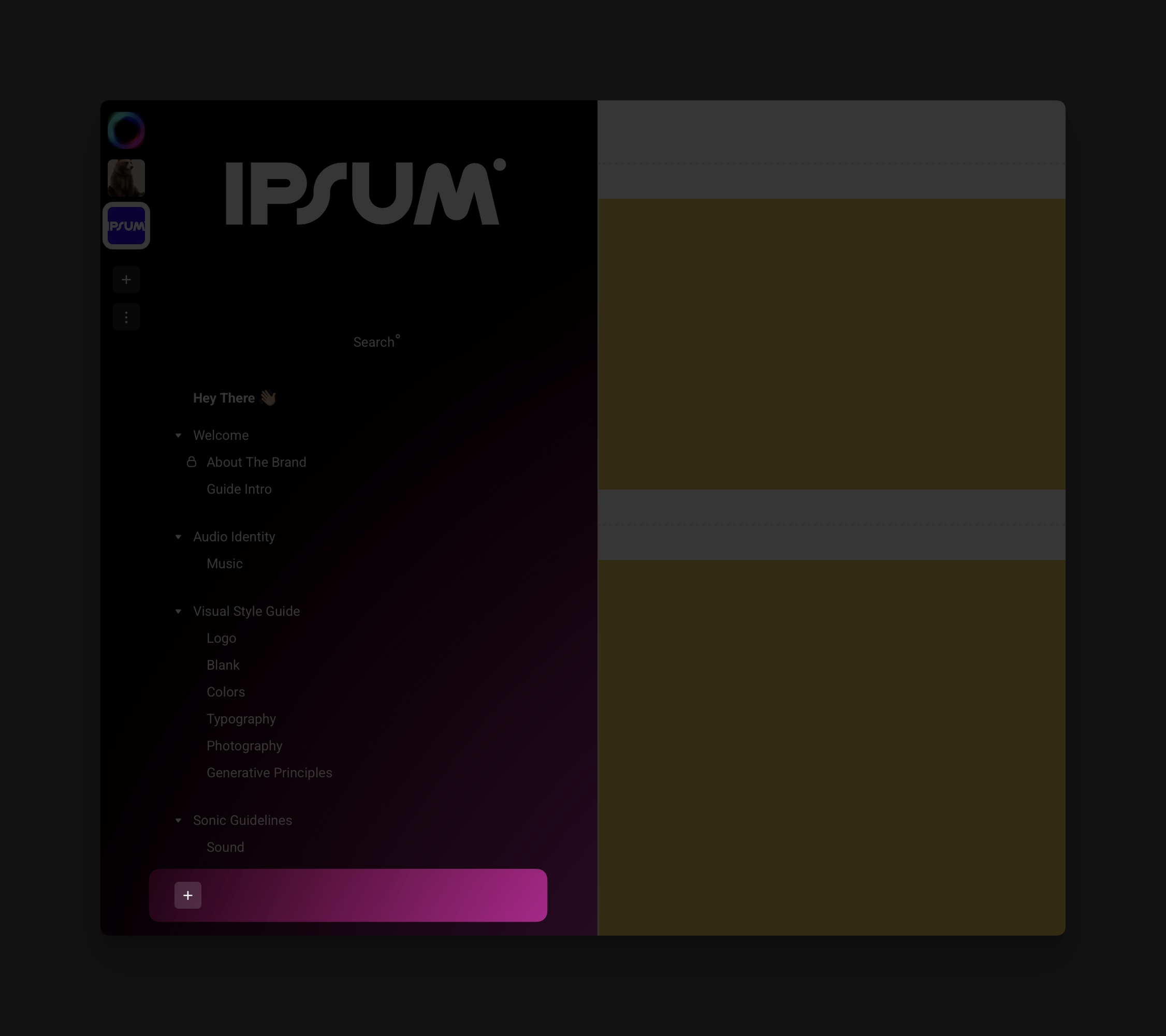
Now let’s bring in content.
-
Click the “+ Add Page” button in the sidebar, just beneath your current list of pages
-
Give your page a name: Visual Identity, Logo Usage, or just Welcome
Pro Tip: Keep each page focused. One concept, one theme.
3. Add Your First Modules
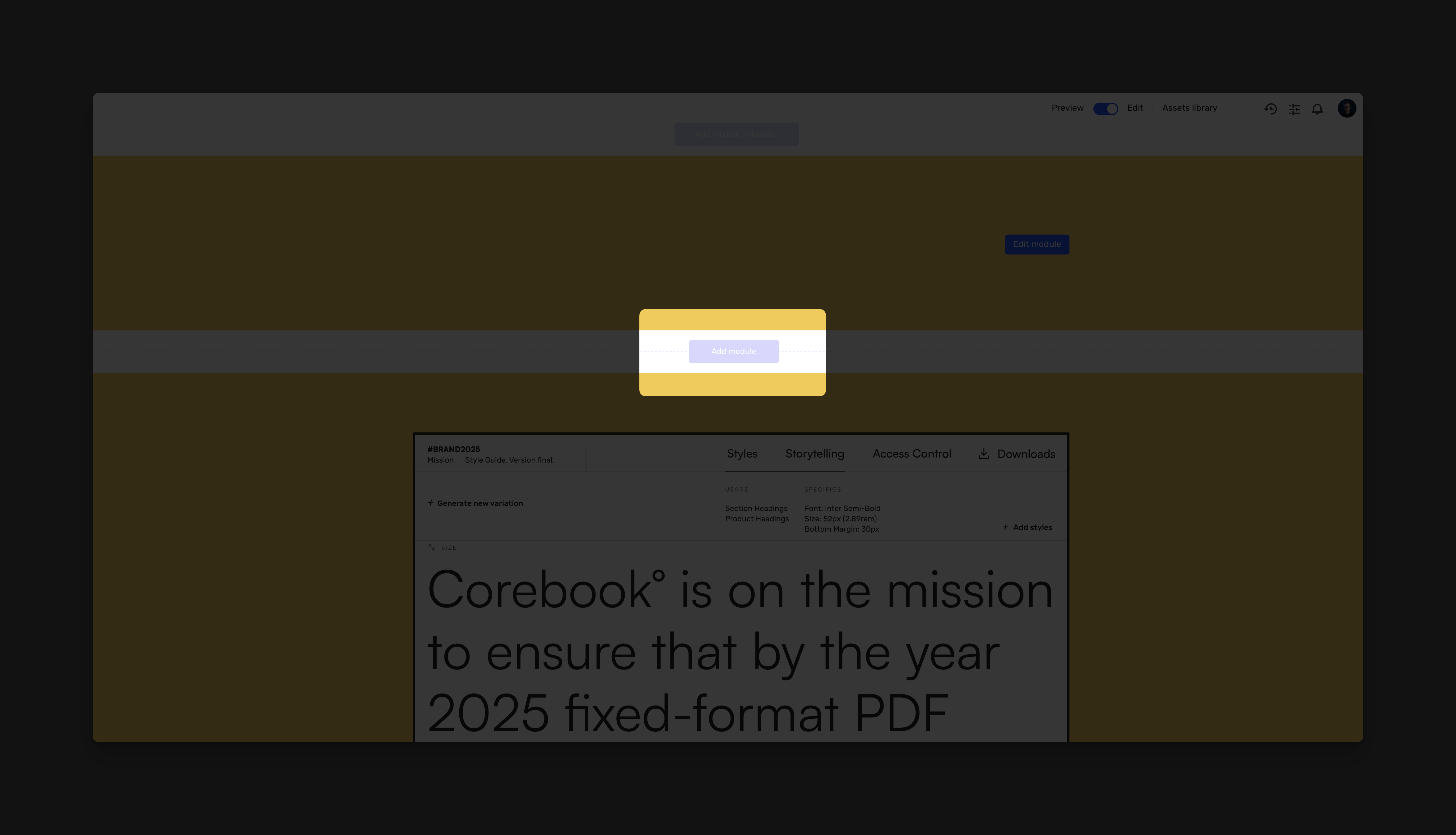
Corebook° is built on modules—drag-and-drop content blocks that structure your guidelines with flexibility and flow.
Here are the most common types:
-
Text Module – Add brand stories, rules, or tone of voice
-
Image Module – Upload logos, product shots, or moodboards
-
Color Swatches – Showcase your primary and secondary color palettes
-
Micro Video – Upload short form MP4’s to bring motion into brand
-
Downloads – Integrate assets within brand guide with contextual downloads
To add:
-
Click the “Add Module” button at the center of any page
-
Choose your module
-
Drop in your content
Every module is editable, movable, and customizable to match your brand’s energy.
4. Edit a Module
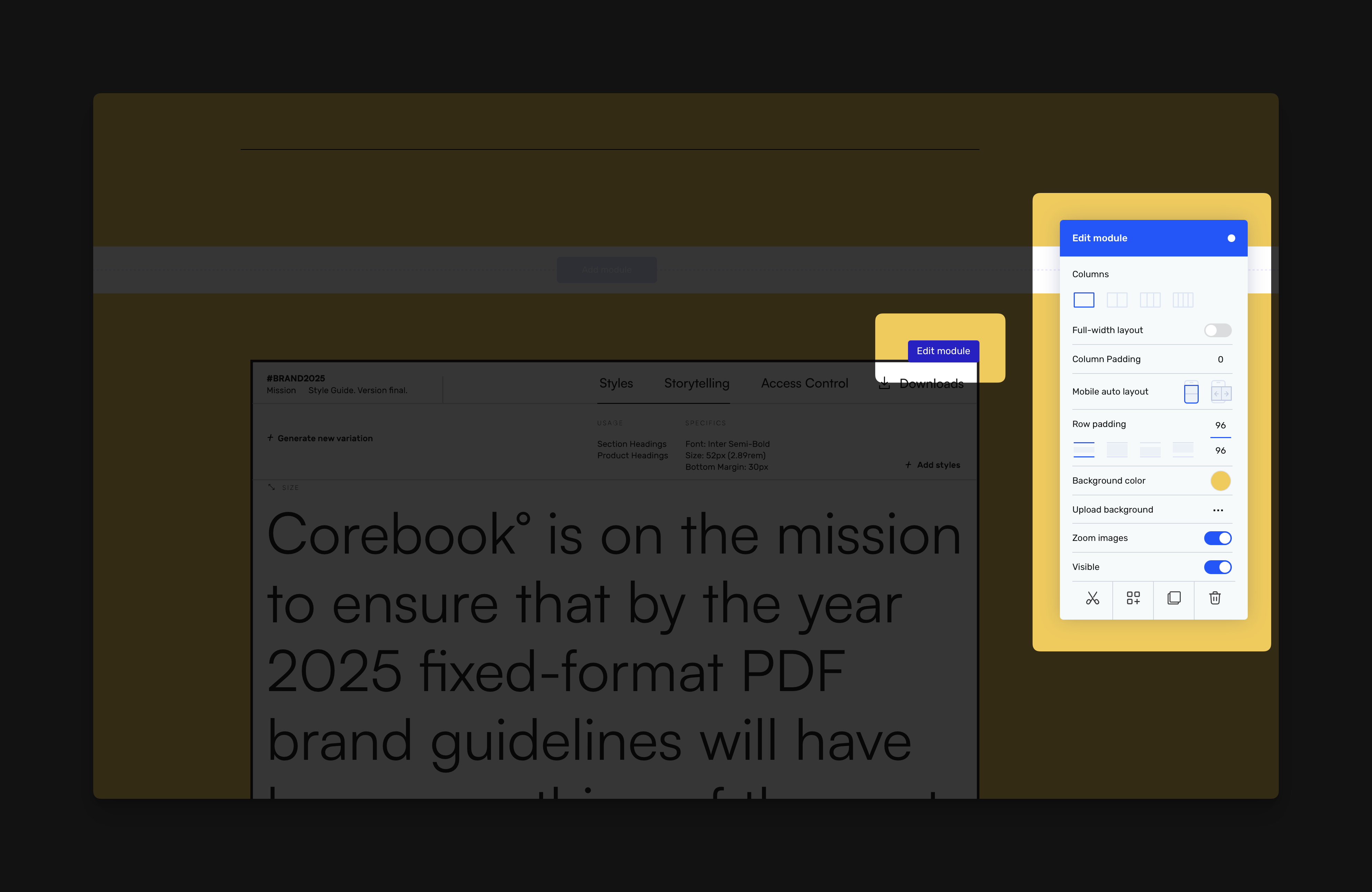
To fine-tune any module, hover over it and click “Edit Module” in the top-right corner.
This opens a design panel with smart tools tailored to the module you’re working on.
Layout Controls:
-
Columns – Choose between single, split, or multi-column layouts
-
Full-Width – Stretch the module edge-to-edge
-
Row & Column Padding – Adjust internal spacing
-
Mobile Layout – Control stacking behavior on small screens
Visual Styling:
-
Background Color – Match your brand tones or use contrast to guide attention
-
Upload Background – Add a photo or texture
-
Zoom & Borders – Set radius, border size, or zoom for images
-
Dim Background – Optional background overlay for text readability
Visibility & Controls:
-
Toggle Visibility – Hide without deleting
-
Add Description – Include usage context or notes for images
-
Duplicate, Reorder, Delete – Use icons at the bottom to manage flow
Note: Different modules have slightly different settings. For example, image carousels support zoom and positioning. Text modules focus on spacing and column layouts.
5. Update Your Brand Color Palette
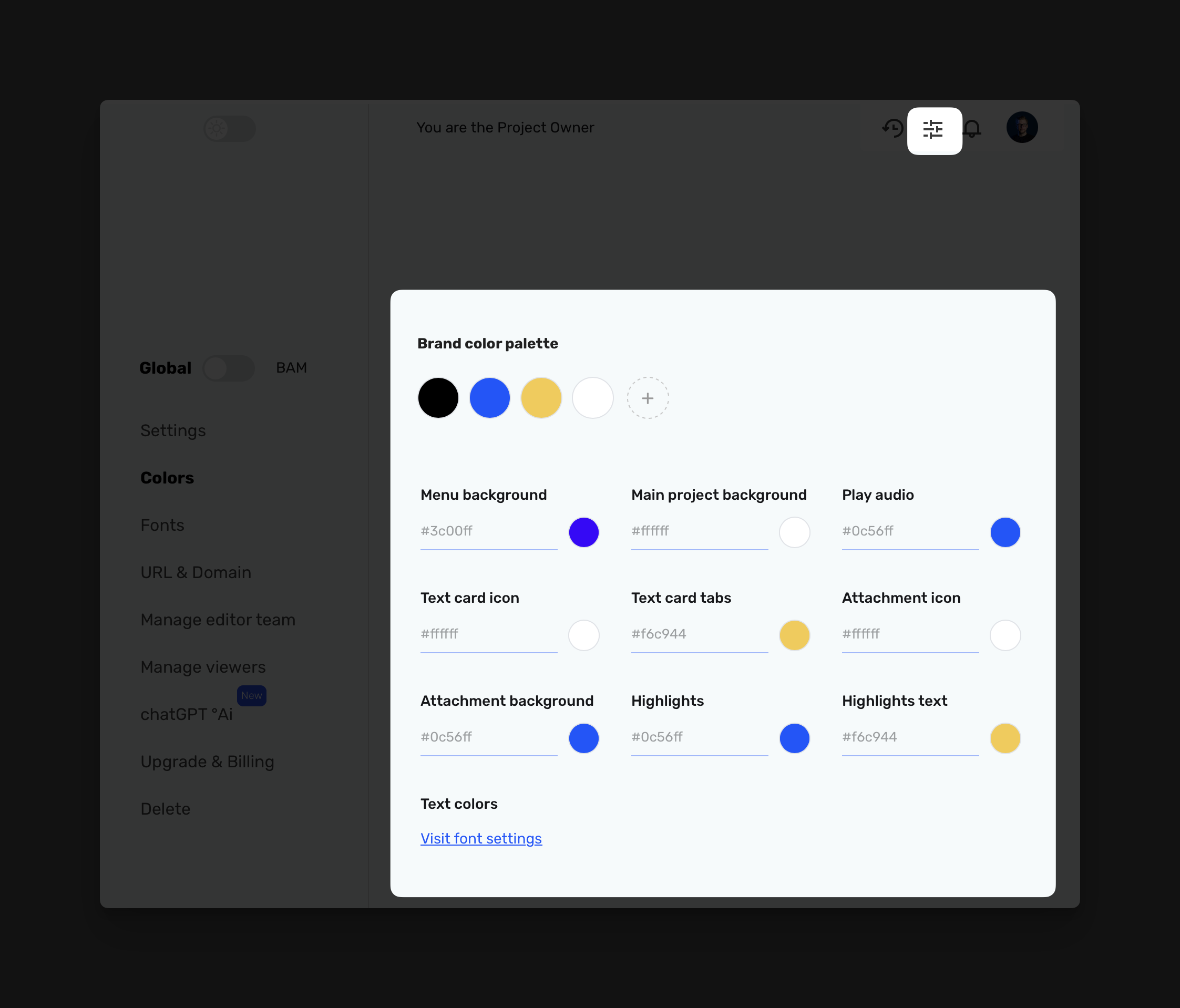
To manage your global colors, go to Settings → Colors in the left sidebar.
At the top, you’ll find your Brand Color Palette. Here, you can:
-
Add or remove swatches
-
Reorder for hierarchy and clarity
-
Apply brand colors to interface elements like:
-
Menu background
-
Text card icons and tabs
-
Highlight styles
-
Attachment & audio blocks
Changes update everywhere instantly. No need to touch each page manually.
Tip: Use HEX codes for precision. Keep your palette tight and purposeful.
Need to align type with color? Click “Visit font settings” at the bottom.
6. Upload Fonts & Set Typography Styles
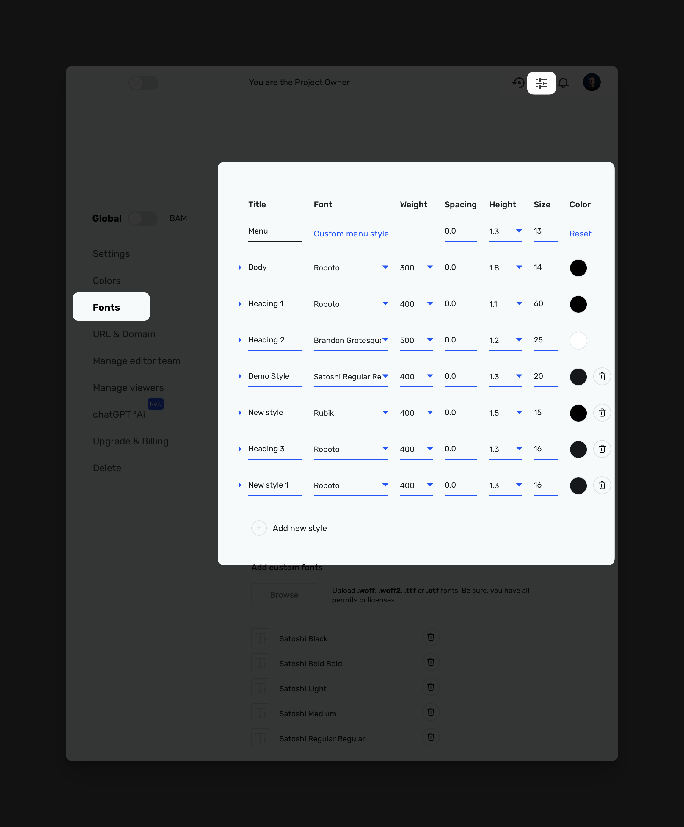
Your brand’s voice isn’t just what it says—it’s how it looks when it says it.
To set that tone, go to Settings → Fonts.
Upload Custom Fonts
-
Under “Add custom fonts,” click Browse
-
Upload .woff, .woff2, .ttf, or .otf files
-
Fonts appear instantly in dropdowns across your style controls
Always ensure you have the proper rights or licenses.
Define Style Presets
Each row in the style table lets you control:
-
Font family
-
Weight
-
Letter spacing
-
Line height
-
Size
-
Color
Use these for body text, headings, CTAs, captions—whatever your system needs.
Click “Add new style” to build a new tier from scratch.
7. Map Figma Fonts
If your team designs in Figma, scroll to Map Figma Fonts.
Match each font used in your Figma file to an uploaded or Google Font inside Corebook°. This ensures design consistency across tools and platforms.
Bonus: If your team uses Adobe Fonts, paste a Typekit embed snippet right in the field provided.
That’s it—you’re rolling.
You’ve set your brand foundation: structure, tone, visuals, and voice. With Corebook°, this guide becomes a living, evolving space your entire team can trust—no more guesswork or scattered files.
Now build. Shape. Share. You're not just managing a brand—you’re bringing it to life.