Interactive text cards.
Create captivating color swatches and palettes with precise control over their size, shape, and displayed color values.
Color systems
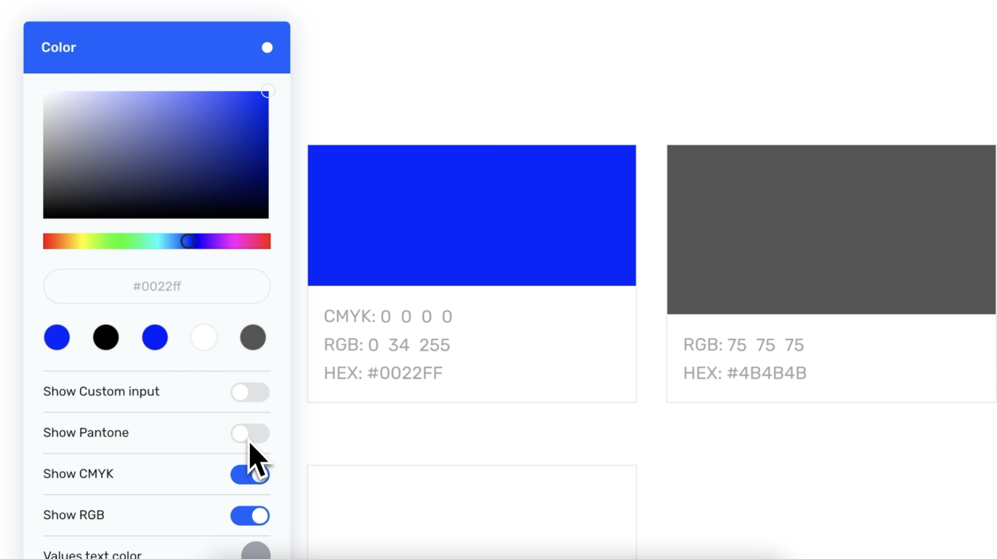
The color module supports all the most widely used color systems: HEX, RGB, CMYK, and Pantone. If your brand utilizes a niche color system, there's also the option to add a custom color system to accommodate your specific needs.

°How to
Create a color module and add a new color swatch. Select your desired HEX color and toggle on any additional values you require. To exit the color swatch settings, simply click on any empty space outside the settings area. You can directly input the necessary color values into the color swatch.
Freeform color swatch shape
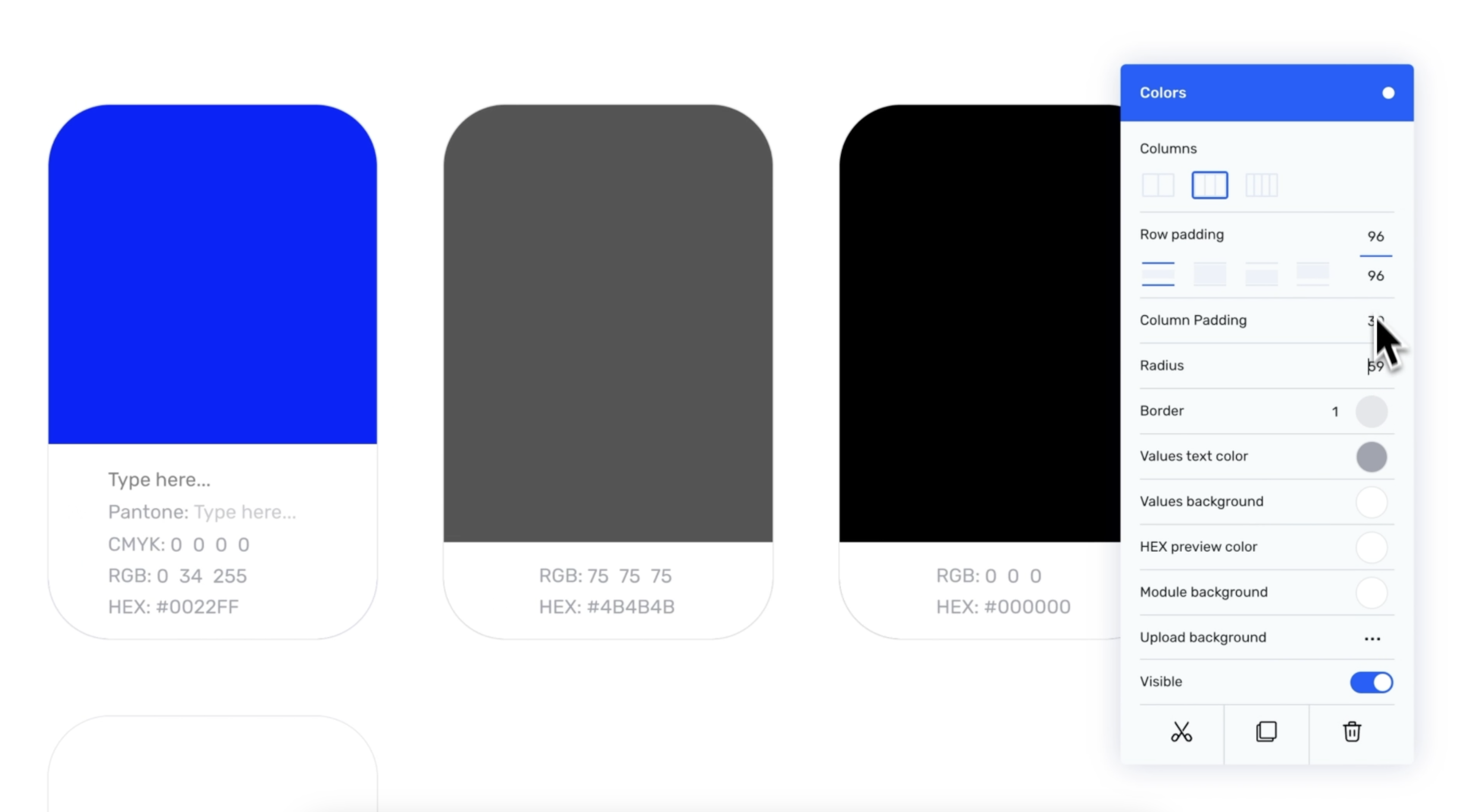
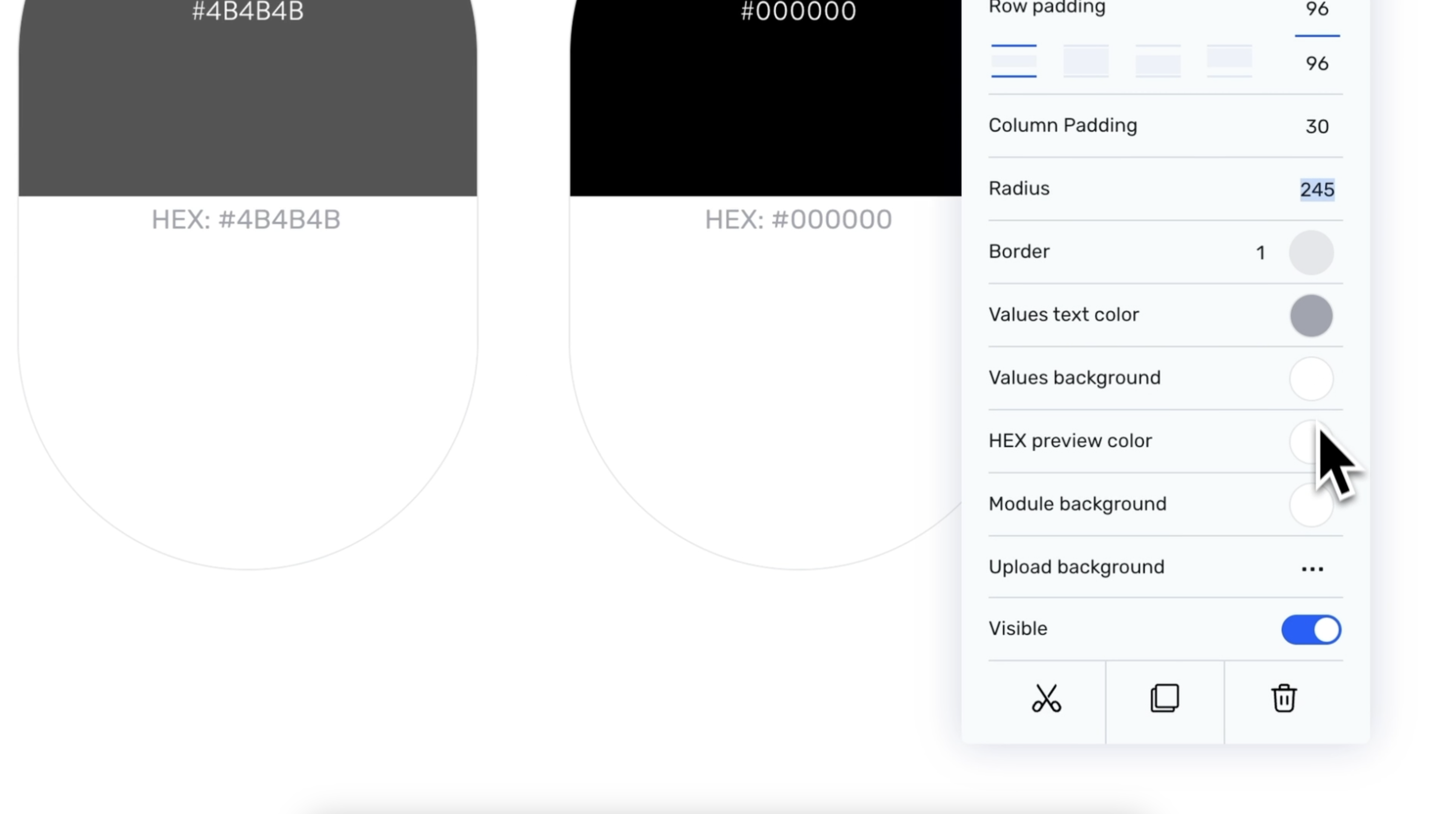
Just like any other module in the Corebook° editor, the shape and form of color swatches can be customized to align with your brand's design. Whether you prefer square, circle, oval, or something in between, the choice is yours to create a look that best represents your brand's aesthetic.

°How to
To adjust the vertical size of a color swatch, hover over it and click and drag the bottom edge of the swatch upwards or downwards to increase or decrease its height.
For additional customization options, click on the module settings. Here, you can proceed to customize various aspects such as the number of columns, the padding between columns, and the radius of the color swatches to better suit your design preferences.
Custom color swatch colors
Personalize every detail of the color swatches to match your brand's unique design, even if it includes the most vibrant and unconventional color schemes. This can be achieved by altering the color of the value labels, their background, and the preview color, ensuring a perfect fit with your brand's aesthetic.

°How to
To modify the text and background color of the value labels, as well as the HEX preview color and the module's background color, go to the module settings. Once there, click on the circle-shaped color picker to select a new color for each element. This allows for seamless integration with your desired color scheme.


